
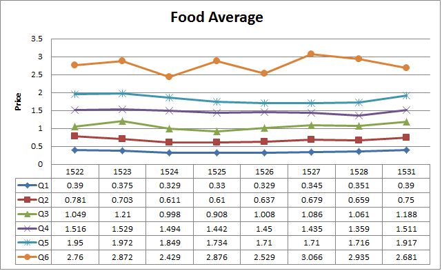
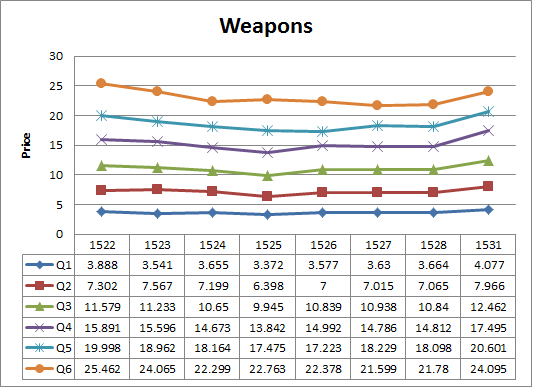
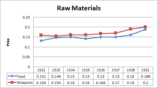
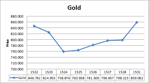
Is this the start of a rise of prices? You be the judge (Day 1531)
Day 1,531, 17:48
•
Published in USA  •
by
•
by
 •
by
•
by Yui MHCP001


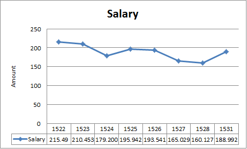
Average Salary
Did you like the new format? No? Tell me in the comments
Remember, you can apply here to get a loan: http://www.tinyurl.com/FedEZCLoans
Here is a General Explanation of the Loans: http://www.erepublik.com/en/article/the-loan-system-1954098/1/20
VOTE
SUBSCRIBE
TELL YOUR FRIENDS
SUBSCRIBE
VOTE
-Leos111
Comments
It should be the start of a rise since most people have burned through their toolbox stores and there won't be such a glut of RMs anymore.
I like the format of the graphs, but one of them looks misleading. I'm talking about the gold graph. The drop looks huge, but it's a fraction of the whole amount.
This is true, because of the Y axis labeling. I have no control over that, I think.
wow super look
Really nice ! Actualy better 😛
Good job. v'ed & sub'ed.
AFAIK, you could set the range of Y-axis.