
Let's discuss the new name/logo of our alliance
Day 1,216, 20:00
•
Published in USA  •
by
•
by
 •
by
•
by Emerick
Terra.

Terra.
This is the name and logo that now represents the alliance we're in. Now, I could deal with them on their own, in fact I was thinking that if we had gone with Foundation, we could shoop the bottom feather off of that bird to make his wing into a backwards "F", and it'd be a thing. Not a terrible logo for the alliance. But when you pair that bird with "Terra", you've got nothing. There's no connection between the word and the bird, and it just doesn't make sense.
Now, I'm not saying that jamesw is the worst Secretary General in history because of this, but I've never heard anyone say that he's not.
And what's the deal with Brits and birds? Every alliance they've ever been in has been represented with a bird. Don't believe me, you indignant hampster? Let me drop some knowledge on you:
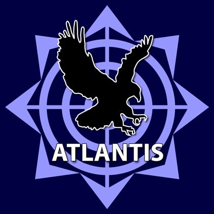
Atlantis: ugliest logo in history, made by either a Swede or a Rumanian iirc.

Phoenix: this logo was actually very attractive. Subsequently, it was the one thing Penix had going for it.
We don't have to be bound by fate. We don't have to have a bird as our logo just because we accidentally let the UK into our alliance.
Look at me.
Do you really want this? Our alliance is named Terra, I can live with that. I can live with the bad puns from humorless countries: LOL HAIL NWO FAIL TERRABLE ALLIANCE XD. Son of a bitch, I'm an American. I'm used to everyone else's humor being childish compared to my own extremely mature and sofisticated humor that seamlessly travels from childish to mature, subtle to in your face. Yeah, I've dealt with these countries who think that Patch Adams is a worthwhile way to spend your time, and not just a mid tiered reference.
But it needs a better logo.
Terra means Earth. Earth, earth. We don't want to have the actualy image of Earth in the logo for two reasons: one, it's lame; and two, there is no Earth in this game, so don't even attempt to bring that imagery up. Rather than the image, let's go with the color brown. Earth tones. We don't want an image that's boring, but rather tranquil. Nothing too busy, just something simple and easy, with calming effects.
Which is why I propose this Koi fish as an upgrade from our current bird:

Nice, right?
But share your thoughts. We all know that this logo is god-awful, so let's improve it. As a matter of fact, I'll make a contest out of it: 10 gold to the best Terra image, I'll get the alliance to accept it.

Another thought: we have France, Canada, UK, USA . . . this is starting to sound familiar
HAIL NATO
Terra.
This is the name and logo that now represents the alliance we're in. Now, I could deal with them on their own, in fact I was thinking that if we had gone with Foundation, we could shoop the bottom feather off of that bird to make his wing into a backwards "F", and it'd be a thing. Not a terrible logo for the alliance. But when you pair that bird with "Terra", you've got nothing. There's no connection between the word and the bird, and it just doesn't make sense.
Now, I'm not saying that jamesw is the worst Secretary General in history because of this, but I've never heard anyone say that he's not.
And what's the deal with Brits and birds? Every alliance they've ever been in has been represented with a bird. Don't believe me, you indignant hampster? Let me drop some knowledge on you:
Atlantis: ugliest logo in history, made by either a Swede or a Rumanian iirc.
Phoenix: this logo was actually very attractive. Subsequently, it was the one thing Penix had going for it.
We don't have to be bound by fate. We don't have to have a bird as our logo just because we accidentally let the UK into our alliance.
Look at me.
Do you really want this? Our alliance is named Terra, I can live with that. I can live with the bad puns from humorless countries: LOL HAIL NWO FAIL TERRABLE ALLIANCE XD. Son of a bitch, I'm an American. I'm used to everyone else's humor being childish compared to my own extremely mature and sofisticated humor that seamlessly travels from childish to mature, subtle to in your face. Yeah, I've dealt with these countries who think that Patch Adams is a worthwhile way to spend your time, and not just a mid tiered reference.
But it needs a better logo.
Terra means Earth. Earth, earth. We don't want to have the actualy image of Earth in the logo for two reasons: one, it's lame; and two, there is no Earth in this game, so don't even attempt to bring that imagery up. Rather than the image, let's go with the color brown. Earth tones. We don't want an image that's boring, but rather tranquil. Nothing too busy, just something simple and easy, with calming effects.
Which is why I propose this Koi fish as an upgrade from our current bird:
Nice, right?
But share your thoughts. We all know that this logo is god-awful, so let's improve it. As a matter of fact, I'll make a contest out of it: 10 gold to the best Terra image, I'll get the alliance to accept it.
Another thought: we have France, Canada, UK, USA . . . this is starting to sound familiar
HAIL NATO
Comments
I ROFL@ "HAIL NATO" 😃
Voted.
Hail NATO o7
Now this is something I can believe in.
NATO ftw!!!!
Hail Nato, lol
"I'm an American. I'm used to everyone else's humor being childish compared to my own extremely mature and sofisticated humor that seamlessly travels from childish to mature, subtle to in your face"
xD
And also, Isn't Turkey in Nato? 😒 😁
Hail NATO!
NATO = No Action Talk Only ? o_0
NATO = No Action Talk Only ? o_0 x2
Very innovative logo, GDI faction - C&C 3.
Hey its back.
NATO = Kick Serbias ass every day of the week
Turkey is nato's biggest army
Hail NATO.
>NATO = No Action Talk Only
I don't know, I've seen them do good work when pressed.
NATO ftw.
NATO = No Action Talk Only ? o_0 x3
Anything would be better than the current name and logo combination.
http://www.thehollywoodnews.com/wp-content/uploads/2010/04/tara-reid.jpg
My contribution. (It's Terra Reid.)
>NATO = No Action Talk Only
Tell that to Serbia and Libya lol
I ROFL@ "HAIL NATO" [2]
Foundation or BROW are better = )
@Trent Lawrence
Indian Wells occupied by Serbs. Moving onto Miami.
http://archives.bulbagarden.net/media/upload/d/df/389Torterra.png
"NATO= No Action Talk Only"
Do I sense wishful thinking?
Hail NATO
LKSE
Let's Kick Serbia Everyday
[removed]
lol AlinUCj i detect strong butt hurt in you : D
wonder what do Russians think about nato lol : D
stEndEc I'm sad because we lost on all battlefields 🙁
How about this one. Russians will understand 🙂
C.C.C.P.
Well, NATO is a little bit better than Terra for sure
I love you. Testify!
Teraj pederase u 3pm 😃😃
NATO = No Action Talk Only
Go ask your parents, they will tell you different.
[removed]
Dude, Terra? seriously, that's...lame...
Terra isn't very good. The emblem is ok I suppose, but I get your point: What's the connection? And the bird gets old. Just say no to more birds.
We should just call our alliance WAR. Kind of to the point anyway. Emblem can be a mushroom cloud.
Terra is Earth. So why a bird? Needs better logo. Name is passable.
The Atlantis logo was made by Mardang.
http://www.erepublik.com/en/citizen/profile/227532
worst logo ever
[removed]
Hail NATO o7
[removed]
I feel sorry for you people...
If it wasnt for Nato you would all be communist, lol. Sorry but thats the truth. So to the response about Nato not doing anything: I guess Protecting you in the Cold war and from russia wasnt much to you.
We want Owl Logo.
HAIL NATO.
I feel sorry for you. Although your current actions will make me feel less sorry for your people next time some disaster hits you. And it will hit you inside 3 to 4 months, count on it.
frustration and complexes
>I feel sorry for you. Although your current actions will make me feel less sorry for your people next time some disaster hits you. And it will hit you inside 3 to 4 months, count on it.
I'm not sure whether or not I should be calling the CIA right now
Umalo vote